I am working with a group of local cyclists to create a new cycling advocacy group. We are working to create a open and inviting group that will attract casual riders, commuters, serious cyclists, and everyone else to think about cycling and participate. We are working on the details, the mission and vision and all that stuff now, and that (in my opinion)is best left to the more involved and professional organizers. I consider myself to be a commuter and that’s about it at the moment. Sure I will do the occasional trail ride, but most of my miles are just getting from point A to B and back to A, with maybe a C thrown in there once in a while. 😉
One of the perks of my involvement is that I get to work on branding the organization. I’m working to create a logotype / mark that will be identifiable as a icon for the group as we start up, as well as being flexible enough to be used in different ways in the future. I am working through some design exercises is to get there, and will be developing a “design system” which we can use for every design challenge that might come our way. Exciting. I hope that I can come up with something we are proud to use for years and years and is identifiable as a mark that represents quality and integrity.
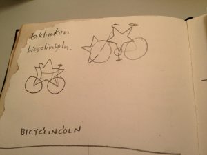
It all started when I happened to run into my friend Andy Pedley on the street and he mentioned this new bike thing he was a part of starting, and they were thinking about calling it Bike Lincoln or Bicycle Lincoln or similar. I thought that was cool. Later on I made this little sketch and combined “bicycling” and “lincoln” into “bicyclinc(g)oln” where the C and G overlapped… it kind of rolls off the tongue in an interesting way, whether you say “Bicycle -incoln” or Bicycling -coln” it is recognizable as a unique name, and the main points are still discernable. Bicycles and Lincoln!
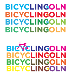
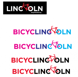
And so- based on the success of that little sketch I took it to the computer, and mocked up this little guy and sent it over to Andy in a facebook message:
He seemed to like it, and it got shared around a bit, so I started in on refining it… working with colors and stuff. Probably getting ahead of myself because what I should have done was take it back to black and white only, to save time. Anyway, I was too excited to dial it back so I kept playing with color and working on a “logo” to make it pop… eventually I started to throw a bike symbol into the mix to spice things up, and I started to like it.
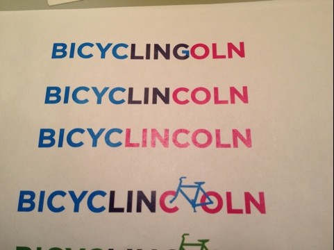
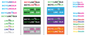
Meanwhile, I had become invited to do the designwork for the group and to come to the next meeting and meet everyone and see what the group was all about. We met at Damon Hershey’s garage and talked about the group and looked at the logo ideas I had brought, below.
I told them I was working through the design process and we kind of voted to use the logo as-is for now, thinking that the red and black version would work well to start out with.
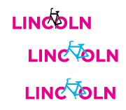
The bike works best when facing the left, to my eye… even though I kind of wish it pushed right to give it the feeling of forward momentum. Maybe that’s just me. Maybe it works fine either way? For now it’s going to point to the left, and that’s just how it is.
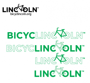
Since we “voted” to use the black and red, I have been playing more with single color variations and using the Linc(bike)oln mark as a stand alone, I think eventually this will work great as the main iconic brand image, with or without the whole “bicyclincoln” name present. It will take some more work but I am very excited to be able to show the progress that’s been made, and will be happy to finalize the process with a set of standards that can be applied accross all media. 🙂
teh futurez?

